The Worst Print Ad Ever Created? (Not the One Pictured Below This Headline)
Fine. I don't mean to pick fights. But being friendly does not mean sitting back and watching train wrecks. I mean to help elevate the industry as I can.
So last night I opened the latest edition of Record Collector News and there was the latest T.H.E. Show print advertisement and I think it's even worse than the original one I criticized, so I made a video that will clearly tick them off, but this is tough love, folks. They need some.
The ad violates every reasonable rule of print advertising: there's no focal point to catch your eye. The layout is really non-existent. The pastel color scheme is bland with no contrast and makes reading difficult. There's just too much stuff thrown haphazardly on the page and there's no central them tying it all together. "We Know Audio"? That's close but look where it is? And is that really the point? Isn't the point "Two Great Audio Shows in 2014 Produced by T.H.E. Show"? Wouldn't that be a good headline that could tie together the two shows? Couldn't both circular logos lived comfortably side by side as the item that catches your eye? Or SOMETHING to catch your eye?
What do you think—I'm especially interested in feedback from people involved in print advertising, art direction, etc. Am I wrong?


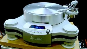


| Equipment Reviews | The Gruvy Awards | Blogs Analog Tips | Columns Music | Show Reports | News Resources |
 © 2025 AnalogPlanet
AVTech Media Americas Inc.
All rights reserved